Category Archives: Retro Reviews

King’s Quest Review

Note: The screenshots posted on this page have been scaled up a little from their tiny native resolutions as well as had their aspect ratios corrected to proper 4:3 dimensions as they should have looked on CRT monitors originally. For posterity’s sake you can also click them to view the “pixel perfect” originals, which I especially encourage for the screenshots of the SCI version, as my conversion process made its dithering shading technique look all kinds of shitty.

Introduction
King's Quest!
“King’s Quest!”

Representing Sierra’s place in my retro reviews section has been long overdue, and I’ve decided to start close to the very beginning with the legendary King’s Quest. Probably the biggest single milestone in the birth of the “graphical adventure” genre as well as the game that truly started Sierra’s meteoric climb to the top of the industry.

Sierra On-line (then simply On-line Systems) got started when founders Ken and Roberta Williams coupled the text based input parser of earlier interactive fiction games with graphical renderings of scenes, trading written descriptions for crude, still images and decidedly less verbose text. Still, this “Hi-Res Adventure” series of adventure games was considered to be quite innovative at the time and turned some heads, including IBM’s, who offered Sierra a contract to develop a game for their upcoming PCjr system. With an actual budget behind them, Sierra developed the next evolution of their graphical adventure game concept by actually animating these screens, showing the player character’s real time movements and actions from a third person perspective, and thus in 1984 the King’s Quest series and the AGI engine that powered most of Sierra’s early landmark adventure games were born. If Sierra invented the genre with it’s first Hi-Res Adventure, Mystery House, it set the new standard for it for much of the rest of the decade with King’s Quest.
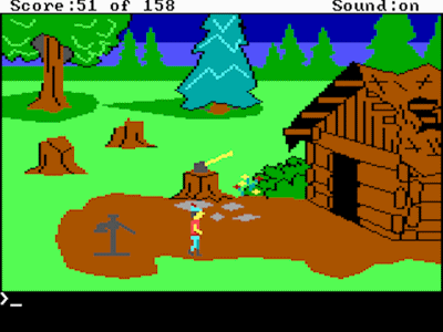
The original AGI King's Quest in all its glory.
“The original AGI King’s Quest in all its glory.”

I honestly couldn’t tell you when or where I was first exposed to the series, only that looking back, the name “King’s Quest” seemed ubiquitous within the personal computer gaming space, and certainly its style of blocky graphics and text parser input was one of the first things my young mind went to when I thought of gaming experiences I couldn’t experience on my consoles and longed for on a computer. Aside from a couple of brief sessions with the original AGI Police Quest at a friend’s house when I was a kid, it wasn’t until getting my first IBM compatible PC in the early 90s that I finally dove headlong into my first Sierra graphical adventure game. Actually, it was Space Quest, not King’s Quest, that I latched onto, and I’m still a devout Roger Wilco fan to this day. Despite being a fan of the fantasy genre, King’s Quest, to me, always seemed like Sierra’s stuffiest, most serious adventure series. Don’t get me wrong, I always wanted to get into King’s Quest, and I remember almost rescuing the budget CD-ROM release of King’s Quest V from the bargain bin countless times, but with my non-existent, teenage funds it just never happened.

Indeed, it wasn’t until the release of Adventure Game Studio in the late 90s, and a team of skilled AGS developers calling themselves, at the time, Tierra Entertainment, released a VGA remake of King’s Quest in 2001, that I actually played the game for the first time. For shame!
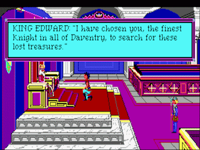
...and so the quest begins.
“…and so the quest begins.”

King’s Quest, like so many old PC games, was ported to all manner of different personal computers and saw a variety of releases and remakes over the years. With this review I’ll mainly be focusing on the 1987 AGI release of King’s Quest, by then renamed King’s Quest: Quest for the Crown, which was essentially just an update of the original 1984 version with a newer build of the AGI engine. I also played and will talk a lot about the 1990 remake of the game, which was done with the AGI engine’s successor, the SCI engine. The 2001 AGS remake I mentioned was based on this SCI version and therefore doesn’t require too much attention of its own, but since many people who decide to play King’s Quest for the first time in 2017 will likely play that version I’ll definitely bring it up as well.

Gameplay

King’s Quest is typical of practically all of the graphical adventure games that came after it: The player guides their character from scene to scene exploring the world, occasionally collecting items. Sometimes the character’s path into a certain area is blocked, an item is unreachable, or perhaps an enemy needs to be defeated. In any case, overcoming these challenges presents the player with a puzzle that needs to be solved. The vast majority of these puzzles involve using previously collected items with the environment. Points are awarded for certain actions, usually collecting valuable items and successfully solving puzzles. I’ll talk a lot more about the actual mechanical aspects of these actions under the Controls section.
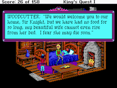
Great. The only subjects of my future kingdom that I actually meet, and they're dying.
“Great. The only subjects of my future kingdom that I actually meet, and they’re dying.”

Unsurprisingly for such an old game, the puzzles are relatively simple. Interestingly though, there are optional items and multiple solutions to most puzzles. One big benefit of having multiple solutions is that the designers can have their bizarre, “moon logic” solutions alongside their more intuitive ones. Of course, it’s the more creative solutions that award the most points or, often enough, don’t requiring giving up an item to complete and losing you the points you received when you picked that item up originally in the process. I appreciate having the option of not bashing my head against my desk in frustration to finish the game, in any case, and indeed at the end of my first time playing through for this review I had completed the game almost entirely with the more straightforward but low point solutions. Constantly tracking and displaying your point total can really encourage a bit more experimentation or at least variety in subsequent playthroughs though, which I like.

One important aspect that differentiates King’s Quest from most later graphical adventure games: Rather than following any sort of highly structured, linear narrative, King’s Quest presents an almost entirely open world right from the start. Outside of a small number of items needing to be obtained and puzzles solved in a certain order, there are no restrictions on where you can go or what you can do. Fans of a more scripted experience might dislike this aspect of it but I find it to be liberating here.
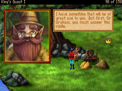
If you don't hate this little bastard you've probably not played King's Quest.
“If you don’t hate this little bastard you’ve probably not played King’s Quest.”

There are negatives too, though. First of all, it’s generally very useful to have knowledge of the various classic fairy tales that Roberta Williams obviously drew heavily from. If you don’t know about the Three Billy Goats Gruff, Jack and the Beanstalk, and Rumpelstiltskin, for example, you might not have a clue how to proceed during certain segments of the game. Second, some of those moon logic solutions are well and truly out there, almost to the point of being Easter eggs. The Rumpelstiltskin puzzle is infamous for this. Finally, let’s just say that the well known and often despised Sierra adventure game practice of brutally murdering the player character at every turn, usually without any warning, and with a frequency that makes the game seem almost mean spirited, apparently started nice and early. My advice is to save frequently and try to laugh at the absurdity of watching your character die in ridiculous ways.

Still, to the game’s credit I actually never got legitimately stuck on a puzzle. There were times I was positive that there were other solutions than the ones I had figured out. For example, I knew I had to be able to dispatch the dragon without throwing my dagger at him, losing it in the process, but the item I needed to do so, and indeed the process I needed to obtain it, simply weren’t nearly as obvious as the dagger solution. Likewise, it was far more logical to me to use the slingshot to dispatch the giant than the other, more peaceful solutions. Look, I know violence isn’t always the answer, but in King’s Quest it certainly holds true that it’s often the easiest solution.
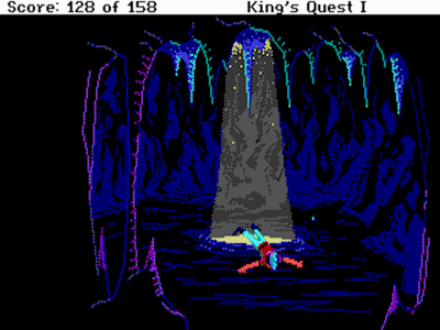
A grand entrance. As an aside, I love the weird color palette of the caves in the SCI version...
“A grand entrance. As an aside, I love the weird color palette of the caves in the SCI version…”

Difficult, perhaps insane puzzles are one thing, but “dead man walking” scenarios are another altogether. These are situations in which if you miss an item or fail to do an action early on, which is easy to do, you won’t be able to solve a puzzle or get out of an area much later in the game. Missing the mushroom before entering the Land of the Leprechauns, for example, will have you solve your way through a few different puzzles and acquire a couple of new, point worthy items before you realize that you’re completely stuck and need to load a saved game from before you entered the area. Don’t have an appropriate save file? I hope you like restarting from the beginning. Not cool.

Personally, I played in a totally methodical way: mapping each screen, searching for any and all potentially hidden items, and checking into if not outright solving any puzzles as I came across them. Using this strategy I only ended up missing one of the non-gated items, and I didn’t end up absolutely needing it to proceed. Again, most of my initial solutions to puzzles weren’t the high point options, but I beat the game relatively easily with few hints.

Story

In the original 1984 PCjr release when you walk into the castle and talk to the King Edward you learn that he’s dying and that his kingdom, Daventry, is crumbling. He tasks you, Sir Graham, his finest knight, with seeking out three magical treasures that can help restore the kingdom to greatness. That’s pretty much the story. The manual itself sets up a better written version of the same exceedingly simple premise, but that’s about it.
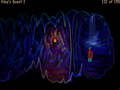
...Expertly updated in AGDI's remake!
“…Expertly updated in AGDI’s remake!”

The 1987 release sets up the exact same scenario in the game, but the manual completely revises the story, setting up a more detailed and darker account of what happened to King Edward and the Kingdom of Daventry that’s more akin to the fairy tales it borrows so heavily from. Instead of just randomly going out and finding these fabled magical treasures, it turns out that the artifacts actually originally belonged to Daventry and were the primary reason it had been so extremely prosperous in the past. With the King and Queen unable to conceive a child, and later with the Queen taken ill and eventually dying, the King let himself be scammed out of all three magical artifacts by a host of devious villains. Without these items, and with the King in a deep depression as a result of all of this tragedy and betrayal, the kingdom began to collapse. It turns out that summoning Sir Graham for this quest is actually King Edward’s final attempt to right his wrongs for the people of Daventry. Damn! He also, having previously seen an image of Sir Graham as the King of Daventry himself, offers up the quest as a way for Sir Graham to prove himself worthy of the crown, and he’s a bit of a dick about it too. Whatever, King Edward. Whatever.

The 1990 SCI remake takes a further step by actually adding some of this expanded backstory into the game. Instead of making you enter the castle and talk to the king yourself, the game starts as you exit the caste, and the whole scene with King Edward is depicted in an optional “introduction” animated sequence. While nowhere near as long and detailed as what’s in the manual, King Edward at least mentions that Daventry has fallen on hard times since losing those treasures, and that finding them will restore it to glory.
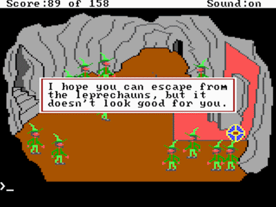
Possibly the only time I recall running into a legion of evil Leprechauns in a game.
“Possibly the only time I recall running into a legion of evil Leprechauns in a game.”

I greatly prefer the revised backstory, as sheds so much more light onto the Kingdom and gives Sir Graham real purpose in completing his quest. Sure, you still casually stroll in an out of dangerous situations and never get too far beyond the confines of the castle itself, but it takes a lot less headcanon to get immersed in, at least. If you’re planning on playing any version of King’s Quest, I’d recommend reading it first.

All that explained, King’s Quest has nothing in the way of an actual in-game narrative and, until the very end, has no real plot development to speak of. Unlike other some games that set up a scenario and plop you down in it, the previously reviewed Maniac Mansion being a great example, the environment you explore, objects you find, and characters you meet do little to help flesh out the Kingdom of Daventry or add to the story. Sure, there’s a lot of neat things to discover along the way, but they largely feel like exactly what I imagine they are: a collection of random references to other stories. With such terse text descriptions and narrations and no conversation system, the game relies almost entirely on its graphics alone to give the world something akin to flavor. Unfortunately that’s not anywhere as close to as effective as some well written text could be. The SCI remake goes a ways into correcting this by having both more detailed graphics and animation and more verbose text, but even so, don’t expect to go into King’s Quest expecting to fall in love with the Kingdom of Daventry or be whisked away by the game’s intriguing plot.

Controls

I realize that describing the controls in such detail might be unnecessary, but since King’s Quest more or less invented this style of game, I feel like it’s appropriate to go into a bit more detail here.

Your screen is dominated by a third person perspective view of an area with your character positioned on it. You can move your character around on this screen from left to right and, typically, back in forth with some degree of depth, depending on the scene itself. Scenery and other obstacles can block your path, narrow paths and stair cases have to be navigated, etc. When the character leaves the screen they are moved on to the next scene. All of this movement is done in real time akin to a more action orientated game. Again, this was pretty groundbreaking stuff.
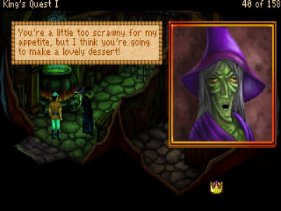
A great example of the AGDI remake's updated visuals.
“A great example of the AGDI remake’s updated visuals.”

One common annoyance with this system is the fact that moment with the keyboard feels a bit imprecise, with pressing a direction starting movement and it not stopping until you manually attempt to stop it or you hit something. This can sometimes lead to falling off ledges or accidentally going too far and onto into another scene. It wouldn’t be so bad if you didn’t need to move so often, such as positioning Graham next to certain objects in order to interact with them, as opposed to being automatically moved as in later games. From my understanding, movement was actually intended to be done with a joystick, with the stick only moving Sir Graham when it is pressed one direction or another, stopping him when it is re-centered. While this works much, much better, I suspect the percentage of people who played this way was minuscule.

Couple that with the sometimes pixel perfect accuracy needed for navigating obstacles and you have probably the game’s biggest annoyance. At the very beginning of the AGI version of the game the player needs to take Graham across a bridge going over a moat and into the King’s castle. Many players fail to line Graham up on the 3D plane correctly or fail to adjust their path for the odd shape of the bridge, sending him into the moat where he’s quickly devoured by alligators. Having your character brutally die at the very start of the game while attempting to do something utterly inconsequential is a seriously fucking rude introduction to a game, I’ve got to say. Luckily this type of thing doesn’t happen too many more times, with the only other extremely notable occurrence being the giant beanstalk climb. This scene is infamous for how goddamn frustrating it can be, with even the slightest moment of even a fraction of Sir Graham’s hands leaving the beanstalk resulting in an instant, terrible death.
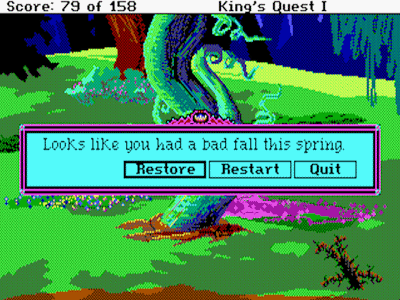
Oh man, get used to seeing this goddamn screen.
“Oh man, get used to seeing this goddamn screen.”

The SCI remake of the game added mouse movement of the sort that would later become standardized as the engine (and the entire genre) soon became totally “point and click” which, while having problems of its own, feels quite a bit better than using the keyboard to navigate in my opinion. Unfortunately, it’s still imprecise enough to cause scenes like the above mentioned beanstalk climb to suck just as much as in the original, that, and I swear they actually made the other way to and from Land of the Clouds more difficult. It feels like artificial difficultly rather than any sort of engine issue, which makes it all the more frustrating.

As mentioned, all control outside of movement is done via commands in a text parser, just as with text based adventure or interactive fiction games. The text parser is simple, not understanding a lot of phrasing or a lot of synonyms, but in a way its simplicity makes it easy to use, and I don’t think I ran into too many issues with getting it to do what I wanted. It’s not great, but it’s something that isn’t too difficult to work through. The biggest problem with it is that when something doesn’t work it is usually extremely vague and unhelpful about why.
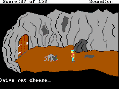
Not the hardest puzzle in the game.
“Not the hardest puzzle in the game.”

Another complaint I have about the text parser is the lake of a consistent “look” or “look around” type command, which means a lot of opportunity to give us a flavorful written description of an area, including the notable objects in it, is wasted. From a practical standpoint, this means that if you can’t identify a part of the environment or an object you may not know how to look at it or pick it up. For instance, I had no idea that I was looking at a four leaf clover in the clover patch, or that it was even a clover patch to begin with, because “look ground” hadn’t worked on other screens earlier on so I had abandoned trying it, assuming instead that those funky shapes were just a different sort of flower like the ones on almost all of the screens depicting the wilderness around Daventry. Thankfully the SCI remake corrects this, adding a general “look” command and appropriate, nicely written descriptions of areas. It also maps looking at an object to the right mouse button, making it far easier to discover significant objects in the world, or at least milk every tidbit of flavor text out of a particular scene.

Finally, another important aspect of this kind of a text based input is time sensitive action. That is to say that when the action picks up, quickly trying to type in a command in such a way that the parser is happy with it, without typos, can be a bit of a pain. This is especially annoying when combined with the above mentioned movement issues. Getting close enough to an NPC to talk to it before it wanders away being the most common example. I didn’t have any major issue with this in King’s Quest, but the fact that the SCI remake pauses the action while you type in a command is a noticeable and much appreciated improvement.

The Tierra (now called “AGD Interactive”) remakes attempted to copy the more modern “point and click” interface of later SCI games, particular the implementation featured in King’s Quest V. I won’t go into depth about all of the differences in this review, but it does of course introduce some major changes, including a much more limited set of verbs to use. I personally have always preferred the point and click style interface, so I welcome the change, though it does feel a little disingenuous after just playing the original text input versions.

Graphics

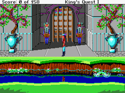
The graphics of the original version of King’s Quest, as with other AGI games, are quite crude, with massive pixels resulting in an overall very blocky aesthetic. I’d always wondered why, despite the AGI and the SCI versions both outputting in 320 x 200, SCI games always looked so much better. Well, after some research I learned that this owes mostly to the game’s origins as a PCjr game. The AGI version actually renders at a lower resolution (160 x 200) and the pixels are doubled to 320 x 200 in order to save memory while still outputting what was at the time, a vibrant 16 color palette. I’d imagine this also made porting to the game to a variety of other contemporary platforms easier, since screens wouldn’t usually need to be reworked to accommodate for lower resolutions.
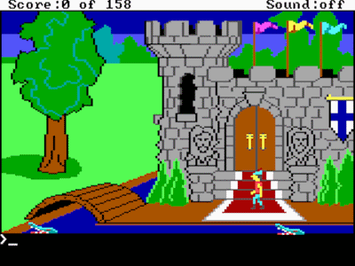
Leaving Castle Daventry (AGI)
“Leaving Castle Daventry (AGI)”

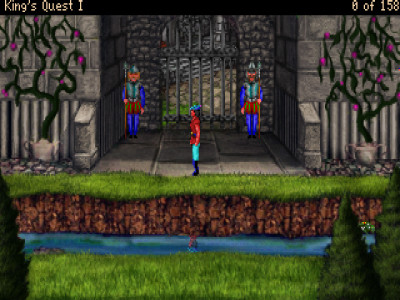
Leaving Castle Daventry (SCI)
“Leaving Castle Daventry (SCI)”

Leaving Castle Daventry (VGA)
“Leaving Castle Daventry (VGA)”

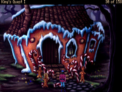
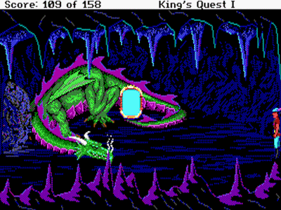
The 1990 SCI remake of the game makes much better use of the resolution, with sharper, more detailed backgrounds and sprites, and uses the, by then limited, color palette much more effectively by deploying dithering techniques for more advanced shading effects, simulating more than 16 colors on the screen at once. While these early SCI Sierra games lack the beautiful, hand painted screens of later 256 color VGA games, they definitely didn’t lack the artistry that came with them. My main takeaway, having played both versions back to back, is that the improved graphics of the SCI remake give a lot more character to the world of King’s Quest, and given my above complaints about a lack of descriptive flavor helping define the game world in the Story section, is a welcome improvement. The more detailed animations don’t hurt either, even if they do to shift the game into a bit more of a exaggerated, cartoony direction.
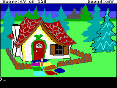
The Gingerbread house looks... okay? (AGI)
“The Gingerbread house looks… okay? (AGI)”
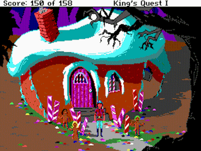
Now that's a little better! (SCI)
“Now that’s a little better! (SCI)”

Masterfully updated. (VGA)
“Masterfully updated. (VGA)”

The more recent AGD Interactive remakes replace all of the art of the SCI version with new artwork. While the original releases included modified versions of many backgrounds and sprites taken from other Sierra VGA games, the current 4.x versions feature all new, hand painted art work. Interestingly, while the AGD Interactive remakes are often referred to as KQ1VGA, the graphics actually make heavy use of a full SVGA color palette. I actually prefer the look of the 256 color limitation of VGA when working with such a low resolution, as I find having so many colors on screen with so few pixels looks a little too “busy” but you can force the AGS engine down to run in lower color if it bothers you too much. Other than that, the AGD Interactive version of King’s Quest is quite nice, even if I personally prefer the art style of the SCI version overall.

Sound

The AGI version of King’s Quest unfortunately suffers from the poor sound support that all IBM PCs tended to have in the 80s, with only a sparse selection of harsh, PC speaker generated jingles and effects. The music was a little better on some other ports, like the Apple II version, but all of them are as equally sparse. Oddly, the original PCjr version actually had quite a few more sounds, even ambient effects such as birds chirping in the Daventry wilderness. From what I’ve heard these were pretty terrible though, and would probably quickly grow to annoy me to the point of turning the sound off, so maybe I should be content.
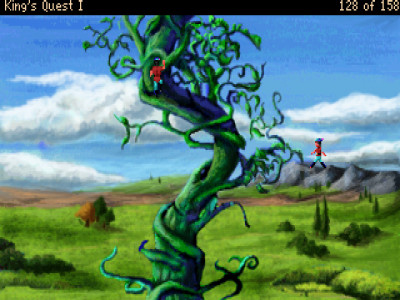
The infamous (and breathtaking) beanstalk.
“The infamous (and breathtaking) beanstalk.”

The SCI remake features music and sound effects using Adlib or Roland MT32 sound. During most of the screens when you’re wandering around Daventry you have no music, only ambient sound effects like the ones I described on the PCjr, only they don’t suck this time around, and actually help with set the tone of exploring alone in a deep wilderness quite effectively. Music does queue up whenever anything interesting happens, like when you enter a special area or a particular event kicks off. There are a number of different songs, nearly one per each of these scenes, which, when combined with the addition of sound effects, add quite a lot to the presentation. I don’t think this King’s Quest soundtrack is necessarily one of the best ones Sierra ever put together or anything, but it does feel appropriate to the tone of the game, matching well with the remake’s bright colors and the game’s overall fairly tale fantasy vibe.

The AGD Interactive remake features more or less identical sound and music to the SCI version, with the music simply being a digital recording of the MT-32 soundtrack. The biggest difference here is that it includes a “speech pack” to add voices to practically all of the text in the game. This is a bit of a mixed bag in my opinion: I think giving a voice to narrator only adds to often enjoyably sarcastic text in the game, which is pure vintage Sierra by the way, and is mostly well executed. Many of the other voices are good, or at least passable as well. The worst offender is probably Sir Graham himself, which is a pity considering he’s voiced by Josh Mandel, who originally voiced Graham in the CD-ROM versions of King’s Quest V and King’s Quest VI. That said, Sir Graham barely talks in the first King’s Quest, so…

Old Age

I played both versions of the game on my dedicated gaming 486, often without worrying about disabling my internal cache or slowing down my machine further via any other method. I didn’t encounter any timing related problems apart from use of the engine’s “speed” setting – with speed on “fast” the game seems to run as fast as it can on your hardware, so while with my cache disable it can be useful for speeding up the process of backtracking, without slowing down my machine the feature is a recipe for an accidental death since I lose practically all sense of control. Not only that, but the speed setting effects everything, not just Graham’s walking animations, meaning all of the animations look hilariously fast too. The bigger issue you’ll need to work around to play King’s Quest on a proper DOS machine these days is disk copy protection. Thankfully most newer releases of the game, including those in most of Sierra’s collections, new and old, have been pre-cracked.
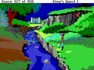
Castle Daventry off in the distance.
“Castle Daventry off in the distance.”

Playing it on a modern system is straightforward. DOSBox is, of course, an option for both versions. I only tested it with the AGI release, but it ran totally fine that way. As an added bonus you can also set your DOSBox to emulate Tandy sound which gives the PC speaker music sound a bit better. ScummVM is also an option, though currently it tends to work a lot better with SCI games than the older AGI ones. Some people have also made their own AGI interpreters updated to work on modern systems, probably the most notable of which is NAGI. You can, of course, emulate other ports and versions of King’s Quest on your platform emulator of choice too.

Thankfully, King’s Quest is easy to legally acquire these days. First of all, GOG has all of the King’s Quest games available in bundle (preconfigured to run with DOSBox) for relatively cheap. My only complaint is that the King’s Quest 1, 2, and 3 bundled doesn’t include the SCI remake, for some odd reason. The King’s Quest collection bundle available on Steam does, however. You can also track down the original disks on eBay, of course, but from what I’ve seen the original game seems to go for quite a lot of money. The various official King’s Quest collections Sierra put out are surprisingly much more reasonably priced, however.
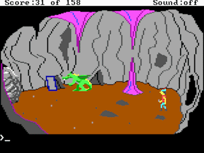
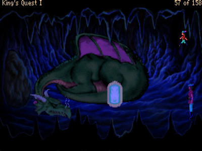
A err... fearsome... Dragon? (AGI)
“A err… fearsome… Dragon? (AGI)”

There we go! (SCI)
“There we go! (SCI)”

I'm not sure which I prefer, really. (VGA)
“I’m not sure which I prefer, really. (VGA)”

As mentioned, there is also the AGD Interactive re-make, which is freely downloadable. This re-make uses the excellent Adventure Game Studio engine to recreate the SCI version of King’s Quest while emulating the interface of King’s Quest V and providing updated, high color graphics and full speech as an added bonus. While there are some minor changes here and there, by and large this is a faithful recreation. AGS can be a bit temperamental when it comes to different graphical settings in particular, but with some experimenting you should be able to make this version work perfectly on a newer Windows machine. Personally, I ended up having to replace the main executable with one from the latest version of AGS to get the game to display with the correct stretched out, DOS style aspect ratio on my 5:4 monitor under Windows 10, and I never could get those settings to play well with the option to reduce the color palette, but your mileage may vary.

King’s Quest was ported all over the place to practically every popular personal computer out there at the time. Graphical output issues aside, these versions were more or less identical to the PC counterparts I reviewed here. The biggest differences were probably on the sound front, with so many older personal computers having wildly different sound chips. Other than some different music arrangements and quality of output, none of them were exceptionally different, however.
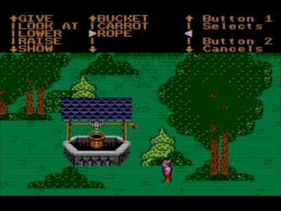
Placeholder
“King’s Quest on an 8 bit console. What an oddity.”

Believe it or not, there was actually also a port of King’s Quest to the Sega Master System, which is by far the most unique version. The puzzles and scenes are more or less the same as in the original AGI version of the game, but as you might expect, going to a system with even more constrained hardware specs the graphics and sound are entirely different. The control scheme in particular is pretty funky, using the controller’s digital pad to move, but using a verb and noun assembly menu, not totally unlike that in the original LucasArts SCUMM games, for performing other actions. It sounds nice, and with some minor tweaks it might be, but as-is it gets a little clunky when you have more than a few items in your inventory. For an 8 bit console port, however, it’s actually not terrible.

King’s Quest’s documentation is available in PDF format with any legit version of the game. Reading it isn’t at all required but, as mentioned before, I’d highly recommend you read the expanded backstory to give your quest in Daventry a little more flavor. Due to the King’s Quest series’ status as an absolute classic the manuals, original hint books, along with walkthroughs and other fan compiled information is also readily available at various sites online without too much searching. The Sierra Gamers community and Sierra Help are great places to start.

Sequels and Related Games

Sierra released two more AGI sequels, King’s Quest II: Romancing the Throne and King’s Quest III: To Heir Is Human before moving to SCI and releasing 4 more titles in the 1990s, cementing King’s Quest as perhaps their biggest franchise. The original series finally game to an end with the controversial 3D action/adventure title King’s Quest: Mask of Eternity. I’m sure I’ll end up reviewing some, if not all of these games in the future. Sadly, it wasn’t until The Odd Gentlemen released their episodic King’s Quest reboot in 2015 that we finally saw another official game in the series. I’ve talked a bit about the 2015 game in the past, if you’re interested.
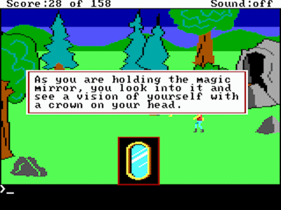
Did I mention it tells the future? Let the sequels begin!
“Did I mention it tells the future? Let the sequels begin!”

While Sierra’s other “quest” games are often grouped together, it’s probably more fair to say that every single game based on the AGI engine, of which there were many, is related to King’s Quest. By extension, SCI engine games were as well. It suffices to say that if you like King’s Quest, either version, you’ll probably like at least some of Sierra’s other graphical adventure game offerings.

Closing

Given that it seems like I’m so often touting the historical relevance of a game when I’m concluding one of these retro reviews, I suppose I need to immediately give King’s Quest a recommendation on that merit alone. Without this game one of the my most beloved computer gaming genres, the graphical adventure game, might have never come to be. Sure, some of the later King’s Quest games go much further into giving you exciting narratives with opportunities to fall in love with the Kingdom of Daventry and it’s heroes and villains, but overall, despite the deaths and dead ends, I actually think the simplicity of King’s Quest could make it a great introductory adventure game for new players to sink their teeth into. Personally, I’m most fond of the 1990 SCI remake’s blend of artistic and technical presentation and it’s hybrid keyboard and mouse controls, but any version you can get your hands on, including the AGD Interactive remake, is a worthy diversion.
Wing Commander Review

Note: The screenshots posted on this page have been scaled up a little from their tiny native resolutions as well as had their aspect ratios corrected to proper 4:3 dimensions as they should have looked on CRT monitors originally. For posterity’s sake you can also click them to view the “pixel perfect” originals.

Introduction

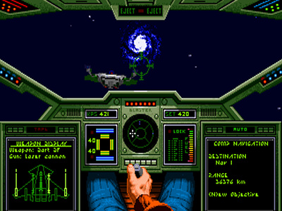
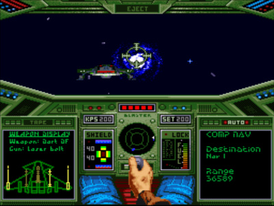
Wing Commander!
“Wing Commander!”

When I reviewed A-10 Tank Killer v1.5 I mentioned the prominence of flight simulators in 80s and 90s PC gaming scene, and I don’t think you can talk about classic PC fight sims without bringing up what surely has to be one of the most influential and impactful PC game series ever: Origin’s Wing Commander, which kicked off in 1990.

When I got my shiny new 486 in 1993 Wing Commander was one of those games whose reputation preceded it. Even as someone who didn’t own any sort of machine capable of playing anything even close to semi-modern and who didn’t follow the personal computer scene all that closely besides, I had heard the name and knew that it was supposed to be something amazing. Cobbling together enough money to buy a used copy of it from a shady used PC game trader from the back of a gaming magazine I finally got to see what all of the fuss was about…

A lot of fuss there was, too! While I feel like Wing Commander is still a well-known franchise, despite not having a new release in something like 15 years now, I wonder how many current gamers really get why. It cannot be understated: when Wing Commander was released in 1990 it absolutely BLEW PEOPLE AWAY. Origin somehow took a bunch of the latest and emerging tech and even some innovations of its own and put them together in a single highly polished package the likes of which hadn’t really ever been seen before. The game included features such as unique 2.5D style scaling-sprite based VGA graphics, a full, highly branching storyline, cinematic cutscenes before that was really a thing, character progression, NPC deaths that actually impacted your gameplay, nifty in-game-world menus, and a dynamic music system with awesome, state of the art Roland pre-MIDI music and effects. This was next level stuff, and not just for flight sims, but for PC games period.

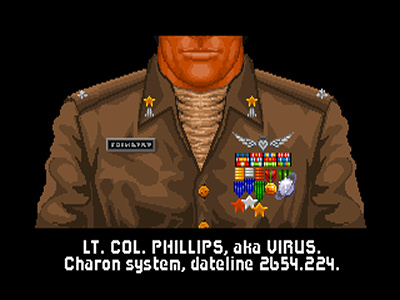
Also, we have funny hats!
“Also, we have funny hats!”

So how’d it go for me? Well unfortunately even though I owned a copy of the game when it was still relatively new and I was of the perfect age and mindset for it, Wing Commander consistently failed to ever sink its hooks into me. I think a big part of that was that I had already been spoiled by the amazingly smooth gameplay experiences of early first person shooters like Wolfenstein 3D and Doom, which used similar “sprite scaling in 3D environments” graphical techniques, and Wing Commander’s engine never felt quite as fast or smooth as those later games, nor did that method of rendering an environment seem to work quite as well in a space game with such a higher degree of freedom of movement. That, and having tried the game a few more times in more recent years I discovered just how sensitive the first Wing Commander game was to timing issues, and I suspect that my 486 probably ran the game fast enough to cause me serious timing problems that I was completely oblivious to at the time – in fact I recall the numerous asteroid field and space mine sections being much more deadly than they are to me nowadays despite my strategy for getting through having never really developed significantly in the last 20+ years.

Much more on all of that technical stuff later though – let’s dig into the game play.

Gameplay

You start the campaign off by losing a round in a combat simulator and stepping out into your ship’s bar, but an adventure game this is not! Instead, these in-between mission sections of the game are represented by a creatively put together in-game-world menu system where most of the game’s options are represented by interacting with objects in the game world. For instance, to save your game you need to click the door to the barracks and click on a bunk. Each bunk represents a different save slot, with occupied save slots represented by occupied bunks. Personally, I love these types of systems and while they were popular in early PC gaming (and have resurfaced mostly prominently in recent years in Starcraft II: Wings of Liberty) few games took it as far or handled it as consistently as Wing Commander.

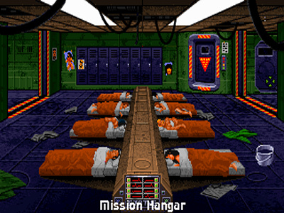
The Tiger Claw's infamous co-ed locker room.
“The Tiger Claw’s infamous co-ed locker room.”

From these menus you have the option of talking to some of the NPCs on your ship to learn tips and hear rumors about the campaign (again, this isn’t an adventure game – these are really just non-interactive cutscenes) viewing your score and commendations, saving and loading your game and, when you’re ready, seeing the briefing for your next mission (again, a non-interactive cutscene) before jumping in your fighter and taking off. In fact, that’s really all there is to the basic flow of the in-between mission game play. While there’s admittedly little to do in this section of the game it is still chock full of atmosphere and helps a lot with immersing you into life as a pilot aboard a carrier ship in the midst of a dangerous conflict. The meat of the game though is, of course, the missions themselves.

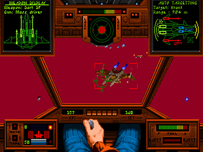
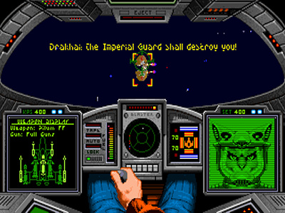
After an exciting (and at the time, kind of mind-blowing) takeoff cutscene you’re thrust into a stereotypical first person flight simulator style view of your fighter’s cockpit from which you can view various instruments and indicators representing the operation of your fighter including weapon selection, armor and shield status, target status, a mini-map, and a targeting HUD as you bob along outside of your carrier. You can also see your fighter from other views and camera angles too which, while neat, is mostly useless as the game was obviously developed with the default first person cockpit view in mind and it seems to work the best that way even for those who might prefer a 3rd person view.

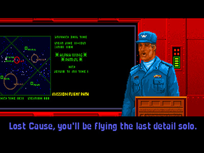
The
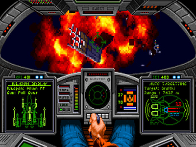
“The “battle camera” view of a particularly hairy dogfight.”

There are a few canned types of missions such as patrols, escort missions, and strikes against specific targets. In reality though no matter the mission type you’ll usually be tasked with just going to a series of waypoints and dealing with whatever obstacles happen to be there or interrupt you along the way which typically means a group of enemy ships, sometimes even multiple waves of them, but there’s also sometimes the aforementioned asteroid and mine fields you have to navigate through as well. And hey, sometimes there’s both! They’ll be some occasional talking head popups confirming orders from your wingmen or showing you taunts from Kilrathi pilots but for the most part there’s no real exposition during the missions and things more or less stick to the plan laid out in the briefing.

Thankfully Wing Commander is very respectful of the player’s time and lets you autopilot between waypoints, warping you almost directly between them. After you visit all of the waypoints and/or beat any other specific objectives you might have, you then fly back to your ship and land. I’m so grateful that landing is an automated process as I can imagine a manual landing into the Tiger’s Claw landing bays being a total pain in the ass if the numerous times I managed to fuck up the simple auto-landing process is anything to go by.

Another unsuccessful attempt to line up a landing...
“Another unsuccessful attempt to line up a landing…”

As you might have guessed by the fact that you’re not forced to make a tense landing after every mission nor endure 10 minutes of monotonous travel between waypoints, the controls and flight model, while certainly more complicated than arcade flight combat games, are both relatively simple and fairly forgiving compared to more hardcore flight simulators. Indeed, while there is 360 degrees of movement, Chris Roberts and company were obviously influenced by the Star Wars approach of “World War II dogfights in space” physics and combat. Often times combat comes down to two fighters just making strafing passes at each other. That’s basically it. There’s no sub-system targeting, missile weapons are extremely limited and aren’t as strong as you might hope for, and there’s not much else to combat than trying to shake enemies off your tail while you try to get on theirs. Of course, as an intelligent player you certainly have options for adding a little more in the way of tactics and finesse to your dogfighting than your opponents do, if you choose. Personally, I’m rather fond of using my afterburners to zip past and get behind my targets or to jet away from them to let my weapons recharge, for instance.

That’s one of the trickier parts of the early game – getting used to managing your fighter’s weapon and shield power. It doesn’t help that the game starts you off with what is, in my opinion, by far the worst ship in the game. As soon as I graduated to the next tier of fighter (with its heavier armor and better weapon loadout) the combat got quite a bit easier and I actually really started to enjoy myself. In reflection I have to wonder if I ever actually got past those early Hornet missions back in ‘93 – that could explain a lot! Still, learning how to fly and having a ship worth flying is only part of it.

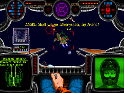
Why not? It's not like we're on a carrier full of fighters or anything...
“Why not? It’s not like we’re on a carrier full of fighters or anything…”

While enemy AI shows some interesting behavior at times (with the Secret Missions 2: Crusade expansion even totally overhauling them) and the different types of enemy ships and pilots (including occasional appearances by enemy ace pilots) employing their own tactics and levels of skill, the real challenge in Wing Commander comes almost entirely from the increasing numbers of enemy ships in each mission as the game progresses. The damage model (which seems fairly developed, allowing for specific fighter systems to be damaged and for some to even auto-repair themselves over time, and at the same time allows for just a few unlucky shots to ruin your day) combined with these often incredibly stacked odds later on makes for a challenging and admittedly fairly frustrating game at times. So you can win a 1 on 1 fight 100% of the time? How about 6 on 1? You survived that? How about you do it 3 more times this mission? It feels a little artificial to always be so outnumbered and frankly it gets a little old. I know our character is supposed to be some sort of awesome ace pilot but if you suspect a massive Kilrathi death armada is in the system maybe you should dispatch more than two fighters to go take them down? Just an idea! It’s not just the repetition, even the most skilled players will have to struggle against shield and fuel attrition to make it through some of the harder missions.

You’re not alone out there, of course. You’re typically assigned a single wingman who will follow you around and sometimes annoy you by flying into your line of fire or just generally being a nuisance. Other times you’ll realize they’re nowhere to be found and wonder if they got blown away without you noticing. You can give them a few basic orders but for a title called “Wing Commander” this aspect doesn’t seem to be as reflected in the gameplay as some might hope. Instead your wingmen are largely useless save their ability to occupy one or two enemy fighters until you can finish off the ones you’re fighting. Throughout my playthrough they only really affected me if they somehow managed to get themselves killed causing me to have to consider restarting the mission. That’s because, awesomely, your wingmen NPC’s deaths are permanent and most definitely noticeable: you might have to fly a whole series of missions solo and there will be an empty chair in the bar where the game otherwise intended you to be able to chat with them during certain sections. I admit I felt like a real asshole whenever I let one die.

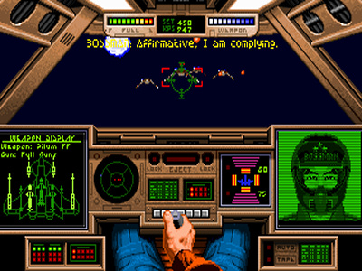
Lining up for the kill on a Gratha... no thanks to my wingman.
“Lining up for the kill on a Gratha… no thanks to my wingman.”

After the mission you’re shown another cutscene depicting your debriefing and, if you got lucky and performed particularly well, an awards ceremony and/or promotion and then you’re shot back into the ship’s bar to prepare for the next mission. That is, in a nutshell, the game.

I can’t end this section without talking a bit about one of the more interesting features of Wing Commander’s gameplay: the single player campaign’s branching structure. You see, after you do a few missions, depending on how well you did, you succeed or you fail that star system, with each condition sending you to a different system and set of corresponding missions to continue the campaign. The complicated lattice structure that develops from this pass/fail system allows for different playthroughs to consist of largely different missions and events, ultimately leading to a final campaign to win the game or a desperate retreat away from the conflict. While I love the idea of this sort of dynamic campaign structure it does seem like the winning path is typically a bit easier and certainly less bleak, and who likes getting kicked while they’re already down, really?

For better or for worse the two expansion packs, Secret Missions and Secret Missions 2: Crusade largely abandon this branching structure with their new campaigns, though they do at least still allow you to lose at certain points during their campaigns, directing you play through a unique retreat scenario before the game ends proper. Still pretty cool!

Story

You’re an unnamed Terran Confederation starfighter pilot newly assigned to the Tiger’s Claw carrier amidst a vicious war against a race of bloodthirsty, feline-like aliens called the Kilrathi. While the NPCs are almost entirely made up of ridiculous caricatures (Spirit in particular is just… remarkable) the ship designs, the silly-but-somehow-still-kind-of-cool Kilrathi, and many of the other elements of the gameworld are actually very well done and really only seem to get cooler as the series progresses. Still, for a game that does such a great job with immersing the player into the life of a space pilot and was obviously so influenced by the tropes of space operas, all of it really does very little in the service of telling an actual story. Your learn a bit about your enemies, about the conflict itself, and of course about your fellow pilots (some of which is fleshed out in the excellent “Claw Marks” manual) but as far as a plot? Well, the game ends with the Confederation either seemingly slowly but surely losing the war, or striking a decisive blow that should set them up for winning it. That’s about it.

When compared to later games in the series it is obvious that the lack of drama in the first Wing Commander is a trade-off for the more dynamic, immersive nature of some of the systems I just spent numerous paragraphs gushing over: naming your own pilot, receiving commendations and promotions based on performance, the insanely branching mission tree, the ability to lose your wingmen? None of that would be very easy to pull off with a heavily scripted narrative.

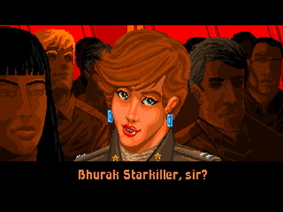
Not much character development but... ooh, shiny!
“Not much character development but… ooh, shiny!”

The two expansion packs, Secret Missions and Secret Missions 2: Crusade improve the story telling a little, probably mostly out of necessity. After all, “Errr, well the war is still going on… so here’s some more missions!” isn’t a very compelling premise for a paid expansion, is it? SM2 goes the farthest into righting some of these wrongs by adding some new twists including new enemies with more interesting motives, new allies, a new ship to fly, an NPC death, and two new wingman NPCs joining your crew. Really, quite a lot for a simple mission pack, and helping bridge the gap between the stories of Wing Commander and Wing Commander II at that. As mentioned the mission tree takes a hit in both expansions but, again, trade-offs, right?

Controls

Again, while this is a flight simulator, it’s a fairly basic one. There are a slew of keyboard controls but relatively few of them with most being unneeded for basic play. Take offs and landings are automatic, navigation is simple and handled by an ever present waypoint system, wingman and enemy communication is limited and simple, etc. I would chalk this up to smart design more than attempt to dumb the game down, personally.

Charging in head first but sending my wingman to flank.
“Charging in head first but sending my wingman to flank.”

I played the game with a joystick as my primary input device which I’d highly recommend. I used an old fashion two button flightstick with my keyboard backing me up most of the time but I’m sure you could map a more advanced stick to have pretty much every keyboard button you’d need on your stick instead. Honestly I’ve always found the joystick controls in Wing Commander to be a little twitchy and inaccurate but “feel” aside, the game doesn’t really require much precision in the first place. Hit boxes on enemy ships seem relatively large meaning they’re easy to hit, ranges on your guns are fairly short meaning you’ll be fighting in close quarters most of the time anyway, and auto-locks for missiles certainly help a bit too. You probably won’t want to try for flying accuracy either, as the aforementioned huge hit boxes make fancy flying moves disappointingly difficult to pull off with anything resembling finesse.

Graphics

This is one of the areas where this game truly shined in 1990. Beautiful 256 color VGA with an interesting style that absolutely screams early 90s personal computer game. While I’m sure that style won’t appeal to a lot of people I have no real complaints about the art itself. There’s all kinds of interesting little touches, cool animations and effects, and heaps of attention to detail and general polish that make the graphical presentation of Wing Commander feel triple A all the way and in many instances still look good today.

The engine is quite interesting in itself. At the time most flight simulators were using extremely rudimentary 3D engines. These had a lot of advantages (many of which probably weren’t as obvious then as they are nowadays) but they were relatively ugly. Wing Commander was one of first games (if not the very first?) to use the “2.5D” style of 3D, using sprites of multiple different angles of an object and some creative scaling to emulate 3D objects moving in space, giving the appearance of fully textured 3D objects well before that technology was accessible on home computers. id Software later popularized this technique with Wolfenstein 3D and Doom before kicking real 3D engines (now with actual bitmapped textures!) into popularity with Quake. Apparently Wing Commander’s tech was what inspired id Software original FPS work, even. Let that sink in!

Angel looks suspiciously intrigued.
“Angel looks suspiciously intrigued.”

It’s not all roses though. As I mentioned in the introduction, the low frame rate, the way sprite scaling works, and the way objects rotate (which is exasperated by the 360 degree freedom of movement Wing Commander offers, unlike the limited perspective offered by something like Doom) add together to make space combat feel a little… clunky?

More than affecting my perception there were many times where it actually affected gameplay: there’s nothing like approaching an enemy destroyer for a strafing run only to find that it has suddenly swung its bow around just in time for you to smash headlong into it, doing massive damage to your fighter and stopping you dead in your tracks. If this had been using a decent 3D engine you could have seen the gradual movement of the ship’s model as it was turning but here in Wing Commander it’s just an instant change from one angle sprite to the next. This happens more than you’d think it would – I already mentioned all of my Tiger Claw auto-landing mishaps, right? And the lack of precision flying because of the huge hit boxes? These things all add up to make flying a whole lot less exciting than it could be, as later demonstrated masterfully by LucasArts’s Star Wars: X-Wing series.

Sound

Like with its graphics, Origin went the extra mile with the technology of Wing Commander’s sounds, particularly its music. It’s an interesting snapshot of the time when Roland’s pre-General MIDI MT-32/LAPC sound was emerging as an incredibly impressive advancement, and Wing Commander even relied on it for sound effects instead of using digitized effects (Sound Blaster was just starting to gain popularity at this point, after all.) If you don’t have (or emulate) an MT-32 then the Adlib does a respectable impression of the soundtrack and sound effects too, with the added bonus of sounding all… Adlib-y. That said, the effects themselves aren’t particularly impressive. Eh, they get the job done for the most part.

Seeing red...
“Seeing red…”

Back to the music though. The main theme and in-flight orchestral music is probably the most well known of all of Wing Commander’s soundtrack though I personally find myself enjoying some of the more subtle tracks in the in-between mission sections more. Hats off to the composers. The in-flight music is definitely the more notable though, as it uses a dynamic system to somewhat seamlessly shift to more intense music when an enemy appears and other events occur. While Origin’s system was surely overshadowed by the impressive LucasArts developed iMUSE system it’s certainly another interesting example of Wing Commander helping to lead the way technologically.

Old Age and Alternative Versions

I played through Wing Commander and both of its “Secret Missions” expansions on my dedicated gaming 486DX PC which was more than adequate to handle the game. In fact, as mentioned in the introduction, the game suffers from some rather extreme speed issues on newer machines. These were gradually fixed as the use of this engine continued over the years. For instance, Secret Missions 2, which apparently uses a precursor to Wing Commander II’s version of the engine, seems to run a little smoother and be less sensitive to the system clock and Wing Commander II itself is an even greater improvement. Still, the first Wing Commander needs to be handled with some serious kid gloves if you want to stand any chance of doing well enough to beat it. This shouldn’t be a huge shock when you remember that despite it’s VGA graphics and other typical mid-90s trappings, this game was released all the way back in 1990 and was probably aimed at no more than 386 machines. It simply doesn’t know what to do with the sheer power of a 486 or Pentium processor. Thankfully using my usual trick of disabling my CPU’s internal cache slows it down to buttery smooth 386 speeds.

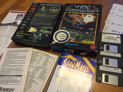
I still have my original copy complete in box.
“I still have my original copy complete in box.”

A better option for most people is going to be DOSBox. I did a fair amount of testing Wing Commander in DOSBox and concluded that, despite a little artificial choppiness here and there compared to running on legit 90s hardware the game runs quite well. Couple that with the usual advantages of being able to use advanced scalars and higher resolutions, as well as being able to easily map all of the controls to your favorite, fancy 300 button USB HOTAS setup, it’s easy to recommend. That, and you can get a legal copy of the game and both mission packs (which used to be somewhat rare!) coupled with the sequel and its own mission packs pre-packaged with DOSBox on GOG.COM for a reasonable price. Awesome.

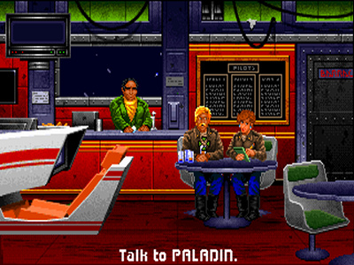
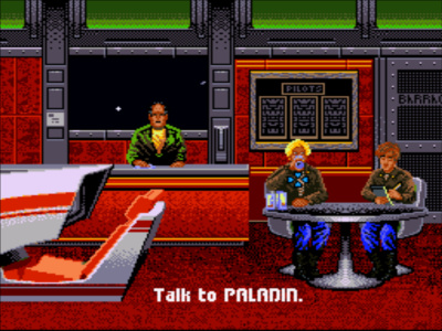
Wing Commander was also one of those classic PC games that was ported to almost everything with any sort of popularity at the time and, surprisingly, this mostly includes game consoles. It’s not worth going into the subtle differences between the DOS, Amiga, and FM Towns ports, for instance, but here are a few of the more interesting ones:

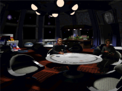
The Tiger's Claw bar - PC
“The Tiger’s Claw bar – PC”

The Tiger's Claw bar - SNES
“The Tiger’s Claw bar – SNES”

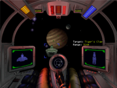
The Tiger's Claw bar - 3DO
“The Tiger’s Claw bar – 3DO”

Starting on the low end, believe it or not Wing Commander and, separately, the first Secret Missions campaign, were released for Super Nintendo Entertainment System. This version sports some drastic differences given the much lower resolution and limited color palette along with the memory limitations of the system – redrawn sprites for many screens, different cockpits, etc. That, and Nintendo made a variety of bizarre changes in the name of censorship. So it goes. Control wise the SNES version somehow manages to cram the most important keys onto the face of the joypad without too much trouble and given that the game was never super-smooth in the first place it doesn’t suffer too badly from being played with the system’s digital pad. All in all I was actually surprised at how well this version plays relative to the DOS original despite the limitations. Still, it does do some kind of funky things with limiting how many sprites are ever on the screen at once and making it so only one enemy is attackable at a time. Oh, and also no saved games! Humph.

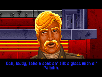
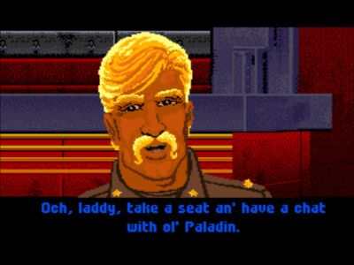
Talking to Paladin - PC
“Talking to Paladin – PC”

Talking to Paladin - SNES
“Talking to Paladin – SNES”

Talking to Paladin - 3DO
“Talking to Paladin – 3DO”

Next up is the Sega CD port released in 1992. At a glance this version looks almost identical to the original PC release, the system’s smaller color palette aside (which is why its not pictured here, by the way.) This biggest difference in the presentation is the audio. Behold, this version is fully voiced! While I couldn’t describe the voice acting as “good” it is average 90s game voice acting which is at least adequate and honestly matches to tone of the game’s dialog pretty well. I can’t really recommend the Sega CD version, however. First, like most Sega CD games there is some considerable loading between screens and, more troubling, general, fairly consistent slowdown in the missions themselves, similar to that experienced on the PC when there is a whole lot on the screen at one time. They were obviously really struggling with system resources when they ported this one – the sprites are also noticeably lower quality than other versions. It’s not terrible but both issues certainly take away from the experience. Worse are the controls – unlike the SNES port, the Sega CD version has you struggling with an unintuitive selection of button and direction pad combinations for even some of the more basic actions. Ugh.

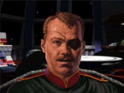
Finally, we have 1994’s “Super Wing Commander” released on 3DO and later MacOS (I tried out the 3DO version.) Bizarrely, this version completely overhauled every aspect of the audio and video presentation of the original game while keeping the original gameplay more or less perfectly intact. The graphics have this gritty, semi-realistic painted look to them that looks very cool in my opinion. I kind of wish this wasn’t an evolutionary dead end for the series, as the closest other games in the series ever got to looking like this was probably 1993’s Privateer. Not only were the graphics a completely different style, but the basic designs of everything, and I mean EVERYTHING, from the characters to the ships themselves, were totally different. For this reason most hardcore Wing Commander fans pretty much loath this version. While I like a lot it myself, I’ve got to admit that the new cockpits are pretty damn ugly and I would have rather just seen new depictions of the old designs done in this new style. A bigger sin to me are the rare moments when the game breaks out of in-engine cutscenes to switch to terrible pre-rendered CGI. I know CGI was really in vogue at the time, especially with CDROM titles, but these really should have been left on the cutting room floor.
Rapier facing the Tiger's Claw - PC
“Rapier facing the Tiger’s Claw – PC”

Rapier facing the Tiger's Claw - SNES
“Rapier facing the Tiger’s Claw – SNES”

Rapier facing the Tiger's Claw - 3DO
“Rapier facing the Tiger’s Claw – 3DO”

The voice acting for Super Wing Commander is totally different than the Sega CD version as well, not necessarily better or worse, just different. Still likeable in a “terrible mid-90s FMV game” sort of way although most people seem to prefer the ones from the Sega CD version. The biggest compliment that I can pay this version is that it looks and plays incredibly smoothly when it comes to space combat itself – the ship and other space object sprites seem to be higher resolution and scale a lot better and the framerate feels higher and more responsive than virtually all of the other versions I tried. Still, it also suffers from the same terrible control issues as the Sega CD port – too many keys but not enough buttons on the 3DO’s joypad to easily map them too. I suppose if you got creative with a macro program you could mimic the PC version’s controls while playing via an emulator but playing this on an actual 3DO in the 90s much have sucked. Interestingly Super Wing Commander contains both of the Secret Missions campaigns and even some unique bonus missions (often referred to as Secret Missions 1.5 due to falling between the other two expansion packs in the timeline of the series.)
Divisive as it might be, of all of the console versions this would without a doubt be my desert island pick… as long as I had a map of the ridiculous controls to reference.

As for the documentation, this game’s lauded “Claw Marks” manual and the other “feelies” included (ship blueprints, mainly) come in PDF format with any legit version of the game. Reading it isn’t required (but is useful for getting around the copy protect if your version has it!) but is highly recommended due to the large amount of additional game fiction and other information (including combat tactic hints, details about technical specifics of Confed AND Kilrathi ships, etc.) it presents. Due to Wing Commander’s active fanbase this documentation, along with other fan compiled information and FAQs, is also readily available at innumerable sites online without too much searching. The excellent Wing Commander CIC fan community is a great starting point.

Sequels and Related Games

Not too long after the release of the Secret Missions 2 expansion in 1991 Wing Commander II: Vengeance of the Kilrathi was released. More on exactly what that brought to the table in a future review, I hope. The famously free roaming take on the formula, Wing Commander: Privateer was released in 1993 just before the highly praised full motion video juggernauts Wing Commander III: Heart of the Tiger and Wing Commander IV: The Price of Freedom were released in 1994 and 1996 respectively. There were a few more spin offs and sequels along the way too, such as Wing Commander: Academy and Wing Commander: Armada, and of course the last proper game of the series, 1997’s Wing Commander: Prophecy. Again, I hope to touch on these games in much more detail in future reviews.

Origin also released Strike Commander, Pacific Strike, and Wings of Glory in the mid 90s which are directly related to the engine and gameplay of Wing Commander, Chris Roberts being heavily involved in the first. Outside of Origin Systems, there were Starlancer and Freelancer, which Chris Roberts was directly involved in and were certainly a continuation of some of the themes and gameplay of the Wing Commander series. Then there’s the currently in-production Star Citizen which has certainly been causing waves if nothing else.

What victory looks like up close.
“What victory looks like up close.”

I feel comfortable saying that virtually every other game in the space flight combat genre has been influenced by Wing Commander and its successors. You really need look no further than the homebrew and modding communities to see just how influential the Wing Commander series was to many of us. There are an incredible amount of unofficial Wing Commander games and total conversion mods for other engines out there and the list continues to grow. Still, as almost all of these are more influenced by the mechanics and presentation of later games in the series I don’t think I’ll go into detail on any particular one of these here. Impressive, though, no doubt.

Closing

Wing Commander was an extremely important game in the history of PC gaming and marks an intriguing intersection between the simulator inspired mechanics of older, more niche computer games and the slick audio and video presentation that would become the norm in modern gaming. While it’s aged relatively well in most respects it’s probably only worth going back to if you’re comfortable with what you’re getting into when you launch off of the Tiger’s Claw: not much in the way of story, repetitive, often unfair missions, and less than stellar flying. Otherwise, later games in the series and other, later space flight combat games borrowed extensively from this game and built upon its shortcomings, making for surely more entertaining visits to the past. Even so, it would be very easy to justify Wing Commander’s place in the 1990s PC gaming time capsule as an absolute classic.

I always do a ridiculous amount of research when I do a retro review and I chuckled quite a bit from this tidbit of a review of Wing Commander from the UK’s PC Plus magazine: “Combat is resolved by locking into the target, centring a cross in the Head Up Display (HUD) crosshairs, then engaging the autopilot.” Ha! While the game doesn’t allow you to autopilot away when there are enemies around, if you could I can’t imagine that strategy would win you too many gold stars…

Duke Nukem 3D Review

Note: The screenshots posted on this page have been scaled up a little from their tiny native resolutions as well as had their aspect ratios corrected to proper 4:3 dimensions as they should have looked on CRT monitors originally. For posterity’s sake you can also click them to view the “pixel perfect” originals.

Introduction

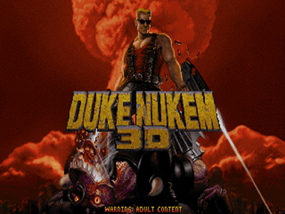
The original, pre Atomic Edition title screen.
“The original, pre Atomic Edition title screen.”

So far in these reviews I’ve talked a little about adventure games and even a flight sim… and now for something completely different: a first person shooter! Yes, another staple of PC gaming here to represent! With all of the buzz surrounding the release of Duke Nukem Forever about this time last year I thought it would be fun to go back and take a quick look at the game’s predecessor, Duke Nukem 3D by 3D Realms. Alongside Wolfenstein 3D and Doom, Duke Nukem 3D is most certainly one of the best known and most beloved of the classic DOS FPS games and one that has unarguably left its mark. It was also one of the last great 2D FPSes before Quake ushered in the wave of polygon based first person shooters and Windows 95 all but finished killing off DOS game development. “Come get some!”

As I had mentioned in my Hugo Trilogy review I used to talk my parents into buying me cheap shareware and budget software quite frequently. I first heard of the character Duke Nukem from one of these same shareware collection CD-ROMs. Amongst a lot of other garbage, it was chock-full of Apogee Software’s offerings from the time including Duke Nukem and Duke Nukem II. As a quick aside, buying shareware might seem incredibly daft to younger readers but in those days unless you had a friend who could “copy that floppy” it was a much more convenient way to obtain games than having to download them via a now mind bogglingly slow modem from a BBS or early online service. Hell, I didn’t even have a modem for the first year or so of owning my first PC! Anyway, I remember trying Duke Nukem and Duke Nukem II and being thoroughly unimpressed. The PC had never been known for great side scrolling platformer/action games and those types of experiences weren’t what I was after when it came to PC gaming anyway. I was, however, definitely there for first person shooters. I loved Wolfenstein 3D, Doom, and Heretic and (usually regretfully) tried my fair share of their imitators in those early years as well.

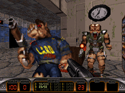
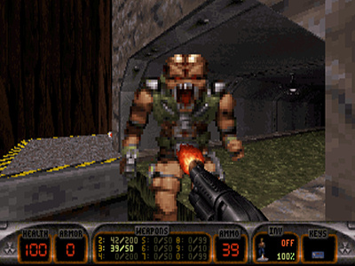
Pig cops, get it? Get it?
“Pig cops, get it? Get it?”

Duke Nukem 3D was released around the time I started to abandon PC gaming – my PC was aging quite dramatically and the limited funds I had as a teenager meant I had to make due with limping along with only the smallest of infrequent upgrades. I had also grown into focusing my PC time into other areas such as programming and hanging around in the BBS and IRC scenes. I believe I first encountered Duke Nukem 3D from one of my best friends who had a new machine and was playing many of the latest titles that I had only read about on boards or in magazines. Insert intense, lingering jealousy here. Shareware copy in hand, my friend gleefully demoed it for me to show me what I’d been missing. My first thought was “Duke Nukem? I remember those lame games… what the hell?” but that didn’t last long. Its technical enhancements such as its more realized 3D environments aside, Duke’s new and improved over the top, badass attitude, a plethora of pixelated “babes” to throw money at, and pig cops to violently dispatch aligned perfectly with our adolescent mindsets. Still, the best way to deal with my awkward combination of jealousy and changing tastes at the time was to be above it: above playing yet another FPS and above the sleazy, dumb humor. There I remained, steadfast in my moral superiority… until the release of Quake. 😉

So, Duke Nukem 3D was NOT a huge influence on me like it was so many other PC gamers. I was familiar with the game, having played a fair amount of the shareware episode both around the time it was released and again after getting better hardware of my own, but it was never one of those games that totally sunk its hooks into me. I definitely have a deeper appreciation of it now, looking back nostalgically, which is a big part of what makes it so fun for me to revisit now for this review.

Just a quick note: While it isn’t my intent to do a direct comparison between Doom, Duke3D, and Quake I can’t help but compare them a little. Not only does Duke3D sit firmly in between those titles tech-wise but I played both Doom and Quake extensively while I consciously skipped over Duke3D which makes the comparison rather personally significant.

Gameplay

Like Doom and Wolfenstein 3D before it, Duke Nukem 3D is an old school first person shooter through and through. You’re dropped into an environment that you have to find your way through from a pseudo 3D, first person perspective. Go from point A to point B – that’s absolutely it in the most reductive sense. Of course the journey is spiced up by having to survive tons of enemy encounters, often surprise ones with enemies emerging from hiding places not unlike Doom’s infamous “monster closets”, and having to sidetrack to find the appropriate keys or switches to unlock doors and other roadblocks in order to progress. Searching for switches and secret rooms, exploring air ducts and underwater passages, and doing tons of back tracking in between acquiring keys feels much more puzzle-like than anything I typically encounter in FPSes today. It also feels a lot less linear!

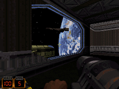
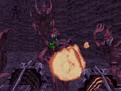
The space levels of Episode 2 are fan favorites.
“The space levels of Episode 2 are fan favorites.”

Duke3D’s puzzles are given further complexity by the game’s inventory system. You can find a variety of items from simple ones like protective boots that let you walk through otherwise dangerous liquids and scuba gear to help you stay underwater longer, to Duke’s awesome jetpack which lets him fly around more or less uninhibited. Often these items are just used as fairly binary solutions to puzzles but even still since they’re never taken away from you they enable additional exploration possibilities. This is particularly true in the case of the jetpack which can be used to traverse entire sections of the map and skip puzzles completely if used creatively. Sometimes the puzzles can be a little frustrating with some levels taking me 20 or 30 minutes to clear the first time through. Sure, there’s a pretty sweet in-game map but those clever bastards made sure to hide obvious hints of places you’ve yet to explore making it all but useless for that. As an aside, I find this old style of FPS just a little tedious to play through these days. Running through a few levels is a lot of fun but doing it 42 times? Ugh! At least it was a lot of bang for your buck, I suppose.

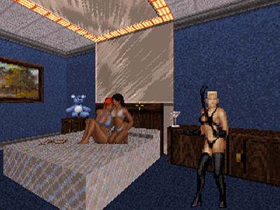
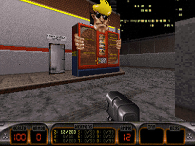
Err, took a wrong turn into a movie set.
“Err, took a wrong turn into a movie set.”

Finally, I feel like I should mention the environments. The Build engine allows for some approximation of rooms over rooms giving the maps more complexity and a greater sense of verticality than in earlier FPS games. It’s not quite night and day as Doom, for instance, could also fake it to a degree. Still, it’s especially worth mentioning when paired with Duke3D’s attempts to replicate real life environments. While far from perfect it does so much more convincingly than Doom ever did. Seriously, even as a kid I thought Doom II’s city levels were laughable. That was Earth… reeeeaaally?! Duke3D on the other hand drops you right into the seedy streets of Hollywood from the get go. It also features all kinds of neat little interactive objects in the environment (light switches, surveillance screens, toilets, etc.) and while these were mostly just gimmicks they did at least help establish a better sense of being in an actual place. You can also break a lot of static objects which could sometimes reveal hidden items or uncover doors. Not such a gimmick is that you can also blow massive holes in select walls. These cracked walls can be easy to miss and are a much cooler way to hide secret rooms and alternate passages than the old, stale sliding door with the same texture as the wall trick.

DNKROZ go!
“DNKROZ go!”

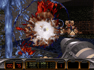
Duke3D’s combat is exactly the same as Doom’s – I’d even say that unlike some other older FPS games I’ve played the two engines feel pretty much identical. The most obvious differences in the combat in these early FPS games is with weapons and enemies. While Duke3D’s enemies were pretty interesting, with the most basic enemy type being able to fly and the upgraded version being able to cloak, for instance, it really shines in the weapon department. The genre has kind of gotten away from it these days but it really seemed like all of the Doom wanna-be FPS games that came out around then were trying to up the ante on the destructive power and creativity of weapons. Some did better than others and I feel like Duke3D borrowed extensively from all of them when it came to designing its arsenal. Even the most basic, starter weapon, the pistol, is effective and satisfying to use and while you have staples such as the Ripper machine gun (chaingun) and the RPG (rocket launcher) things get much more interesting when we continue up the list. Remotely detonated pipe bombs and laser trip mines? Sweet! There’s also a freeze gun that freezes your enemies solid allowing you to shatter them to pieces any way you choose. There’s even a shrink ray which shrinks your enemies so that you can stomp them into a bloody smear. Oh man, and I love the Expander! Duke can also deploy his “mighty foot” melee attack at any time with a separate button. Nowadays pretty much every shooter out there has a dedicated, separate melee key but back then if an FPS allowed you to melee it was usually selected in the same clumsy manner as any other weapon.

Surprisingly Duke doesn't have anything clever to say when this happens.
“Surprisingly Duke doesn’t have anything clever to say when this happens.”

Between the more realistic levels, interactive objects, inventory items, and the crazy weapons it’s easy to see why the game was lauded as a hefty technical upgrade from Doom but where many of those features really came into play is when it came to death… err Dukematch. The non-linear levels with multiple passages, doors that could be closed from either side, lights that could be switched on and off and shot out, security cameras and laser trip mines for setting traps, Holoduke decoys, etc. all proved to be fun additions to the sandboxy, ambush heavy, predator/prey style of old school competitive multiplayer. As someone who played a ton of Doom deathmatch back in the day I instantly recognized Duke3D’s potential in that area the first time I saw it in action and obviously the developers did too as many of those additions seem to have been made specifically with multiplayer in mind. I haven’t played much Duke Nukem 3D multiplayer myself but I know it was a popular LAN game in its heyday and must have been an absolute riot.

Finally, I can’t skip at least mentioning the Build engine’s awesome editor. It was freely available and even came with registered version of the game. It was known for being one of the simplest, most intuitive level editors out there and greatly helped in Duke3D having the absolutely massive amount of 3rd party levels and mods you can find today.

Story

Duke Nukem, coming back from space after the events of Duke Nukem II, gets shot down over a dystopian Los Angeles and finds himself in the middle of an alien invasion. His plans for some rest and relaxation ruined he goes looking for some revenge, as anyone would. That’s pretty much it. Onto the killing! Well, ok, there’s a tiny bit more to it. During the course of the game Duke ends up learning of an alien plot to steal Earth’s women (or at least the young, attractive ones) and being a big fan of young, attractive women he vows to put a stop to it, ending up on some overrun space stations and eventually the alien mothership. After cleaning house there he heads back to Earth where a full scale invasion is taking place. The forth episode introduced in the Plutonium Pack expansion/patch involves an alien queen who is spawning these nasty bastards straight out of Aliens. Blah, blah, blah… nothing to write home about. It’s all pretty much just an excuse to wander through mazes looking for key cards, blasting aliens in their stupid alien faces and there’s nothing wrong with that.
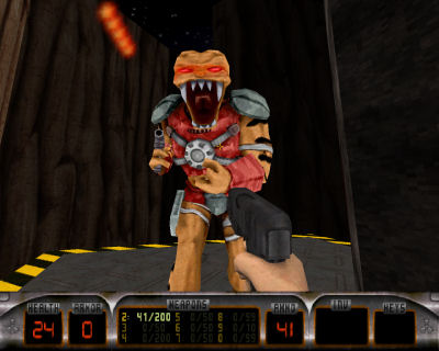
These guys are fucking hard even when there isn't a mass of them and you're not underwater. Ugh.
“These guys are fucking hard even when there isn’t a mass of them and you’re not underwater. Ugh.”

So yeah, not much on the way of a plot, or setting, or any real in-game storytelling going on here but what we do have is something pretty unique amongst first person shooters at the time: a protagonist with a personality! Duke Nukem constantly makes little quips and one-liners as you play through the game which felt pretty damn fresh when compared to the legions of mutes we had been playing as up till then and indeed, afterwards. Duke Nukem is a brash, totally egotistical, testosterone driven smart ass who is apparently Earth’s biggest badass and is all too aware of that fact. He’s basically what an action movie hero like Arnold Schwarzenegger or Sylvester Stallone might be like if they weren’t simply actors, exaggerated up to and well past the ridiculousness of Ash from Army of Darkness (whom he takes quite a few of his queues from) to the point of satire. While Duke Nukem 3D would never come close to holding up as any sort of masterwork of comedic genius (after all, all of the game’s best lines are stolen) and does very little in the way of making any sort of actual commentary on anything it is parodying, it does at least manage to be vaguely amusing at times.

Duke Burger. Who knew Duke also owned a fast food chain?
“Duke Burger. Who knew Duke also owned a fast food chain?”

You can’t talk about the hyper-machismo of Duke without also talking about the alleged misogyny of the character and the game as a whole. Having played through the entire thing again just before writing this I’ve got to say that Duke Nukem 3D isn’t nearly as bad as its reputation would suggest. In my opinion the game’s biggest crime is in casually objectifying women throughout, with all kinds of posters of women, adult magazines laying around, trips through porn theaters, adult bookstores, and strip clubs, and several run-ins with strippers. Things are all mostly all pretty light and, aside from Duke offering up some cash for women to “shake it” for him on occasion, the character himself has very little to say about any of this. While I’d like to say that all of this was somehow tied to the satirical nature of the game there’s actually not a whole lot of evidence to back that up. I think it was probably just a ham-fisted, juvenile attempt to try to include some of the titillation that was common place in the 80s action movies and horror flicks that the game was clearly inspired by.

Pretty much the worst of the 'adult content' in Duke Nukem 3D.
“Pretty much the worst of the ‘adult content’ in Duke Nukem 3D.”

Aside from kneejerk reactions from angry parents, I think most of the eyebrows were probably raised because of the supposed violence towards women. Certainly images of watching a stripper while you’re standing there with an RPG trained at her were a little unsettling. More infamously, you come across nearly nude women who have been captured by the aliens who, upon being interacted with, beg you to put them out of their misery in a very obvious homage to Aliens. You can then, if you want, shoot them resulting in a solemn “damn it” from Duke. You’re not ever encouraged to shoot any of the women you come across or anything like that and other then some pretty silly but mild comments about “babes” that’s about as bad as the game gets. Still, it’s easy to see how wires could get crossed and between forking over dollar bills to strippers and blowing up captive, nude women people assumed the worst. I think the later games in the series pushed that line a bit further with Duke Nukem Forever being the obvious conclusion, but Duke Nukem 3D itself was relatively tame.

Controls

Duke Nukem 3D came out at a crossroads in FPS controls. By default, it shipped configured to use the same old style of keyboard controls as Doom and Wolfenstein 3D before that: Both hands on the keyboard. The right moving you back, forward, left, and right with the arrow keys and the left doing everything else with the left side of the keyboard mostly used – Ctrl, Alt, Space, and Shift were typically used to fire, strafe, use items, and jump, respectively. Like Heretic and a few other games, Duke3D also allowed you to look around vertically using the Insert/Home/Page key cluster. This helped out exploring the more vertical spaces but was a little on the cumbersome side for aiming. This could be bothersome at times because, as I mentioned earlier, the most basic enemy type can fly and the auto-aim alone couldn’t always take up the slack. What we really needed was… oh hey, “mouselook!”

Looking down from the top of a skyscraper.
“Looking down from the top of a skyscraper.”

Not only did Duke3D support free looking/aiming with a mouse but if you wanted you could easily reconfigure your controls to replicate a pretty good approximation of today’s standard WASD + mouselook FPS controls. You have to press “U” (by default) to toggle mouse look but then… much better! Now, I say “much better” but honestly I was one of those guys who clung on to the old keyboard only style for far too long. I don’t think I fully moved on to using a mouse until it started becoming the standard for more and more games. Yeah, what can I say… get off my goddamn lawn! The mouse is a little low on sensitivity in Duke and looking at extreme angles can produce some weird bending effects but otherwise it works fine. I know some games like Marathon and System Shock did it before this but it’s noteworthy to me because the first time I ran into people really using this control scheme was in Quake online, and even in Quake it wasn’t the default control scheme with the few people I knew who used it treating it like it was some kind of “pro gamer” secret.

Oh yeah, and it also supports joysticks and gamepads but… seriously?

Graphics

Duke3D’s graphics were good for the time with the Build engine allowing for resolutions higher than the usual 320×200 VGA mode with VESA compliant cards on machines that could handle the performance cost. The pixilation caused by the scaling of sprites and textures was par for similar “2.5D” 3D engines and at least, like Doom, the game makes up for a lot of that by having good artwork and its own style. Also like Doom, on a faster machine the game will run at a buttery smooth framerate that goes well with the often fast and frantic action. Overall the presentation is strong, feeling more high budget than a lot of the other janky FPS games being releases in those days.
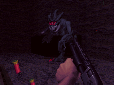
I still have nightmares about these fucking octabrains...
“I still have nightmares about these fucking octabrains…”

While making comparisons with Doom I’ll add to my earlier comment about the way cities and other environments looked by also saying that it seems like Duke3D had a lot more variety in textures which went along way in avoiding the stupid looking city levels of Doom II and boring, repetitious areas in general. This also aided greatly in adding to the game’s repertoire of humorous references and Easter eggs.

I can’t look past the fact the Id Software’s Quake was released just six months later with its amazing 3D engine using real polygons and lighting. It was a huge technical achievement and a total game changer that made Duke Nukem 3D feel a little bit like one of the last of the old guard than the next generation. Still, I suppose can’t ding Duke3D too much for that since it did come out first.

Sound

I’ve already mentioned them when talking about the character of Duke but his one-liners are definitely a standout feature of the game. Content aside, John St. John’s delivery of the character has also always struck me as rather unique. I mean, can you think of anyone else, real or otherwise, who sounds anything like Duke Nukem? The rest of the digital sound effects in the game are good but nothing too special and no real advancement over Doom. In fact, I’d even say that Doom (and later Quake) make better use of sound by providing more creepy environmental ambiance and whatnot.

“Hey look, a video! On this site?”

The music in Duke Nukem 3D is another one of those things that people absolutely love about the game. From the moment the song’s title track, “Grabbag”, kicks in you know exactly what kind of game this is. The first level’s song, “Stalker”, is also a favorite and really sets the tone as you move through the run-down Hollywood buildings filling aliens full of holes. While the songs vary greatly in both style and quality overall Lee Jackson and Bobby Prince (of Id Software fame!) did an outstanding job with this one. Sometimes it rocks and other times it conjures an eerie sense of paranoia. I played through the game in General MIDI/Sound Canvas mode using my Roland SC-88 and using a real, live MIDI module is definitely the best to experience the soundtrack. It still manages to sound pretty cool in Sound Blaster/Adlib mode and is honestly probably the more nostalgic way to revisit the game’s soundtrack for most people out there. There’s just something about hearing those crunchy FM synthesis tones that really takes me back.

Unfortunately the Quake one-upmanship continues in this department too. While Duke3D might have had Doom’s composer doing some awesome original MIDI tracks, Quake brought in Trent Reznor to stream its soundtrack directly off the CD. Check and mate!

Old Age

As a bit of a departure from my last few reviews I played Duke Nukem 3D a variety of ways. Another, absolutely related departure – no need to mention slowing down my CPU this time! My poor dedicated gaming 486, which is a 486DX/100, plays it acceptably but it can occasionally get far from silky smooth when the action gets heated. It’d be a lot more enjoyable with one of those newfangled Pentium chips all the kids are talking about. I had planned to build a Pentium or Pentium II Windows 95/98 era gaming rig at some point but still haven’t got around to it so sadly I had to make due with (again, only slightly) laggy gameplay for some of this review.

Some? Yes! Fear not, technology is an amazing thing! I always mention DOSBox in my reviews since it has so prominent (and so damn good!) but I usually tend not to use it. This time around, however, I did quite a lot of playing with DOSBox. Not only is it fully compatible but Duke3D plays like a dream in DOSBox and if you use any sort of scaler and a higher resolution in your configuration it’ll even look a notably better than running natively to boot. Seriously, playing it full screen on my 19” 1280×1024 LCD with my controls set to typical WASD+mouselook bindings felt more or less like playing a modern port of it. In fact, I preferred playing this way over playing with any of the modern Windows ports I found. So yeah, one vote for DOSBox!

Windows ports?! Yeah, Duke3D has been ported all over the place and while I’ll talk more about the earlier ports below the newer (2003+) open source based straight ports of the engine are easy and popular ways to play the game these days. eDuke32 is probably the most popular and sports a smoother, more modern feeling engine at current screen resolutions and even has high resolution model and enhanced music packs available to modernize the experience even further. Like I said though, I prefer the original via DOSBox. It still looks like the original and maintains all of the DOS version’s charming quirks while also running and playing great on modern hardware.

eDuke32 doing its thing.
“eDuke32 doing its thing.”

eDuke32 doing its thing... with the high resolution pack installed.
“eDuke32 doing its thing… with the high resolution pack installed.”

Playing with any of these methods still requires a legal copy of Duke Nukem 3D. Thankfully you can find it all over the place. Acquiring a hard copy, particularly the Atomic Edition, used on eBay or Amazon is easy and usually cheap enough unless you’re out for a copy of the big box. Personally, I’d suggest just grabbing it digitally – you can still register the shareware version of the game directly at 3D Realms though my personal preference would be to pick up the DRM free version of the Atomic Edition over at Good Old Games, or GOG.com or whatever they’re calling themselves nowadays. Seriously, I love what GOG does and the awesome old software they make available for us so given the choice I’d always choose to support them.

I also played through the entire 4 episodes of the Atomic Edition in the Xbox Live Arcade port of the game. The XBLA version is pretty much a straight port with no graphics, content, or anything else altered other than modernizing the controls to work with the Xbox 360 controller and making the awesome multiplayer modes work online via Xbox Live. Unless you have an aversion to playing FPS games with a two stick controller this is a great port and a great way to play Duke Nukem 3D on modern hardware. I know the game was also ported to IOS but I haven’t tried that version as of yet. Still, it doesn’t sound amazing and the thought of playing it with a touch interface makes me wince.

The more… interesting… ports were released in the 90s. While the Mac version was pretty much a straight port there were also different versions released for the Sony Playstation, the Sega Saturn, and the Nintendo 64. Most console ports of yesteryear had to undergo massive changes to get them onto the platform in question which was usually a fairly negative thing. Sometimes the games end up with upgraded graphics, different levels, or other changes that end up being enhancements or at least curiosities. The Playstation version of Duke Nukem 3D (subtitled “Total Meltdown” for some reason) for instance features an entirely new fourth episode. The most unique of all of these ports is the Nintendo 64 version which, while heavily censored, features tons of modifications to the maps, including some totally new ones, some new weapons, and a lot of changes to the artwork. On the downside there’s absolutely no in-game music. Whaaa? Still, seems like a lot of people played “Duke Nukem 64” and despite its shortcomings it’s still pretty widely regarded. I never played it when it was new but playing it now it seems like a very adequate introduction to the series. That said, a pipe bomb launcher is no substitute for a good RPG at your side.

A nice scan of the Atomic Edition manual is available when purchased from GOG.com or directly from 3D Realms. Let’s be honest though, a manual really isn’t required for this type of game. Unless you’re a completest don’t worry about it. If you are, thanks to the game’s rabid following you can find a huge amount of technical info, FAQs, and whatnot to read elsewhere online. Here is a nice, detailed walkthrough on the 3D Realms site, for instance.

Sequels and Related Games

While not true sequels, Duke3D had a variety of officially authorized mission packs including Duke It Out in D.C., Duke Caribbean: Life’s A Beach, and Duke: Nuclear Winter. These were generally well received, particularly the former two, as having excellent level design and fun themes. Thanks to the Build engine there were also a metric fuck ton of other user created maps and mods, many of which found their way to stores by way of shovelware CDs. There were of course other games developed using the same engine though Blood and Shadow Warrior are the most notable since they were also developed by 3D Realms.

There were some odd ball, non-FPS games released in the 90s such as Duke Nukem: Time To Kill and Duke Nukem: Land of the Babes on the Playstation, which were very much Tomb Raider knockoffs featuring Duke, and Duke Nukem: Zero Hour on the Nintendo 64 which was more of a straight third person shooter. There was also Duke Nukem: Manhattan Project, a 2.5 side scroller (think Shadow Complex) budget title released on the PC and later ported to other platforms such as Xbox Live Arcade. I remember it being pretty well received at the time, surprisingly. I played through the XBLA port of Manhattan Project and enjoyed it for what it was. It’s important to note that all of these games continued to use the version of the Duke Nukem character established in Duke Nukem 3D with all of the humor, women, and one-liners intact, if not dialed up a little even.

Boomstick for queenie!
“Boomstick for queenie!”

Finally, the actual sequel to Duke Nukem 3D, Duke Nukem Forever, was released in 2011 after an infamously long and disastrous development cycle. While I’m obviously not going to go into a full review here I will say that the game makes a strong effort to do a lot of what Duke3D did originally only moved into the modern age. Its got all your favorite weapons and enemies and its got a lot of the same style of humor with even more voice acting throughout. There’s actually somewhat of a story too! Unfortunately they also upped the ante on the objectification of women angle and while I think I argued my case for Duke Nukem 3D not being totally “misogynistic” I’m not sure I’d be up to the challenge for making such a case for Duke Nukem Forever. Women are objectified to higher degrees and not only are they clearly depicted as sex objects this time they’re also depicted as unintelligent with “bimbo” stereotypes on full display. Oh, and they included a bunch of actual nudity this time too! All that said I would recommend Duke Nukem 3D fans at least try it out.

Closing

Duke Nukem 3D is a true classic both occupying a notable spot in the development of the FPS genre and bringing us a satirical sense of humor and a loud mouthed lead character that really resonated with gamers at the time. If you’re a fan of old school FPS games or if you’re just interested in checking out what FPS of old played like I wouldn’t hesitate to recommending that you at least give the shareware episode a spin. On the other hand if you hated the gameplay of games like Doom and Doom II or if you find the egotistical jackassery of Duke Nukem annoying or offensive then avoiding this game goes without saying. Personally, while I don’t find the game to be utterly hilarious or anything otherwise obsession worthy, all these years later I absolutely do get it – it’s a well-made, fun game, and I’m glad I decided to revisit it.